We Make Eyelet®
We Make Eyelet is a creative clothing brand for young adults featuring bold designs inspired by enigmatic creatures. Our dedication to accessibility and sustainability is demonstrated through our intuitive online user experience and our use of ethically sourced materials.
In this case study, I outline my ongoing process of launching a clothing business. This comprehensive project includes branding, product design, UI/UX, and web design. Our work began with pencil sketches for the T-shirt graphics and has evolved into using UI systems and AI tools to enhance our online presence. I will detail the current status of the project, the challenges faced, and the solutions we are actively working on.
ROLE
Owner, Creative Director, UI/UX Designer
TEAM
Small family business with my son
DESIGN PROBLEM
We Make Eyelet faced the challenge of establishing a cohesive brand identity that resonates with young adults while addressing the complexities of product design, UI/UX, and web presence. The brand needed to convey its unique aesthetic, characterized by enigmatic creatures while ensuring accessibility and sustainability. Exploring advanced tools and AI technologies was crucial to streamline the design process. The goal was to create an intuitive and engaging online shopping experience with seamless navigation, accessibility, and a strong visual impact for customers seeking unconventional styles and environmentally conscious fashion.
DESIGN SOLUTION
To address these challenges, we combined advanced tools and creative processes. We defined We Make Eyelet’s unique aesthetic with bold, enigmatic designs and maintained a focus on accessibility and sustainability. We leveraged tools like Figma variables and AI plugins for efficient design iterations and enhanced UX while using ChatGPT to generate compelling, on-brand copy and refine our UX strategies. Each tool was critically assessed to uphold our high standards of visual design, user experience, and communication.
BRAND
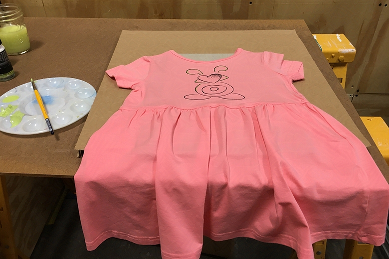
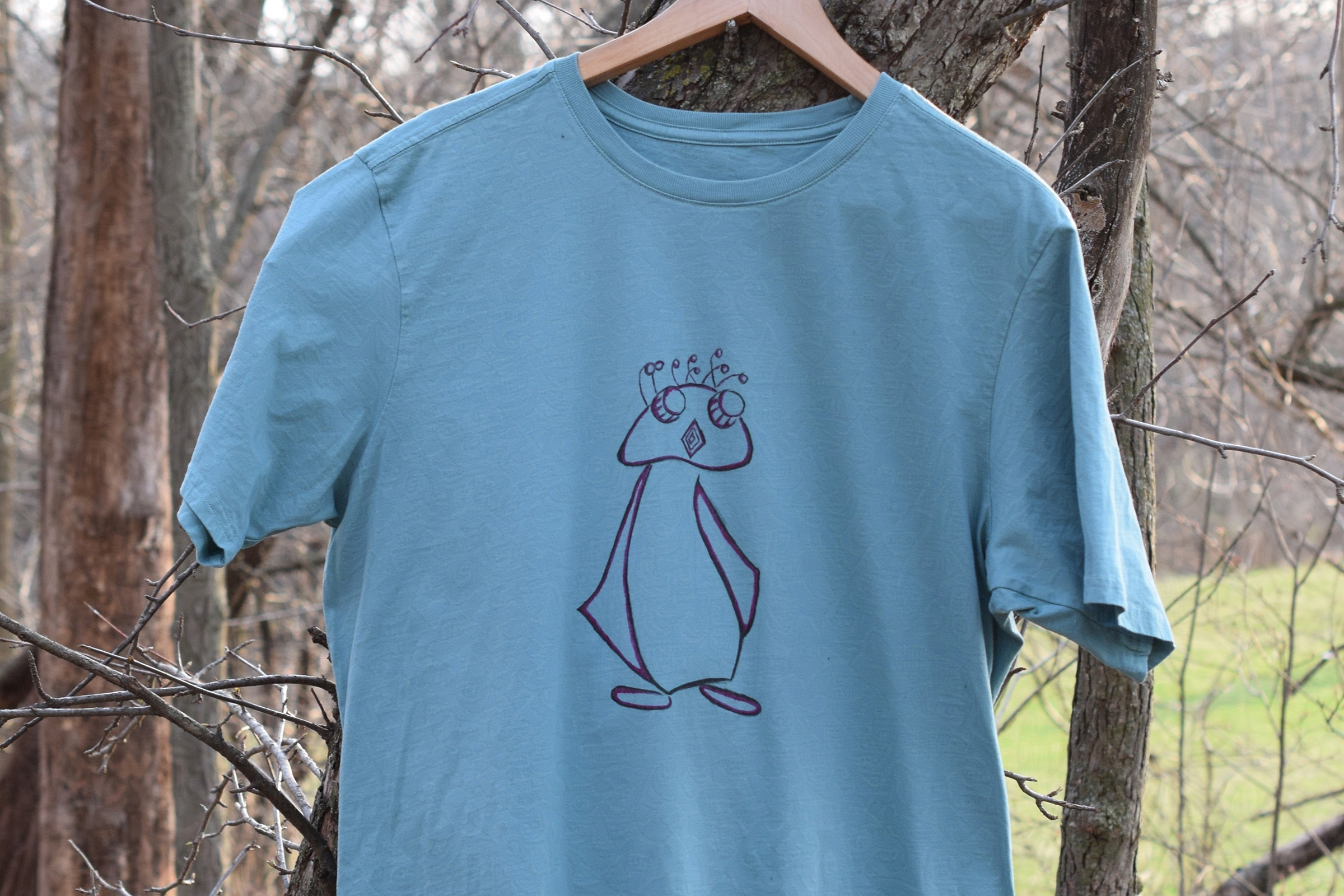
We Make Eyelet, a collaborative project with my son, began with hand-painted T-shirts during the pandemic. Our brand values experimentation and is inspired by constantly evolving visuals. Each collection features a distinct identity, highlighted by our dynamic wordmark with its unique, colorful design elements.
TOOLS & PROCESS
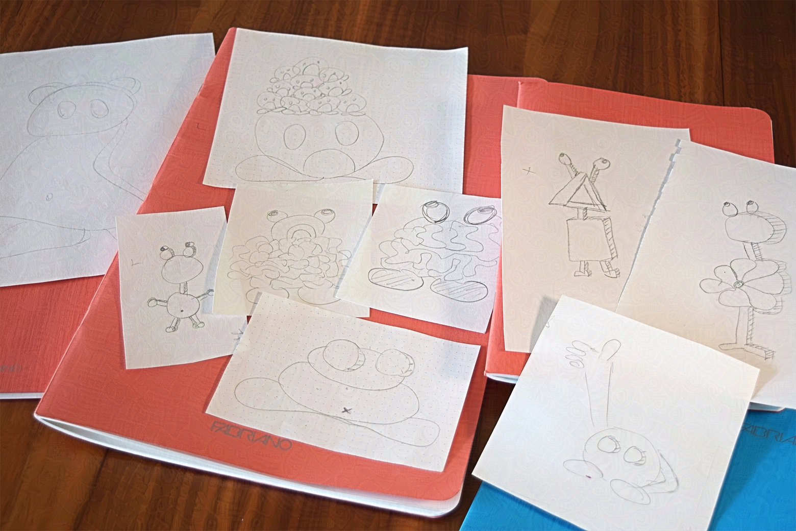
To create the “Eyelet” wordmark, I started by sketching the letters on grid paper. I added angled cutouts and curved elements to the geometric shapes to make the letterforms unique. After refining these sketches with vector lines in Adobe Illustrator, I imported the artwork into After Effects to animate the lines and apply dynamic color changes.

CREATURE COLLECTIONS
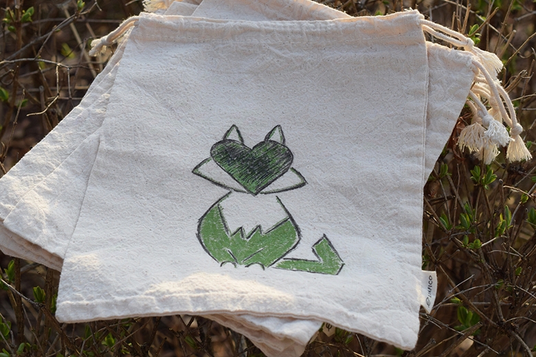
Our initial creature collections featured cute and lovable designs. Over time, they evolved into more enigmatic beings with empty eyes, maintaining their charm while hinting at something ominous. This deliberate ambiguity invites viewers to imagine what lies within. Our current collections include the Screamers collection with Screamin’ Birdy, the Twisted collection with Twisted Bunny, and the Vacants collection with Vacant Teddy. Each collection offers a unique narrative and aesthetic, inviting viewers to explore and connect with their own interpretations.
TOOLS & PROCESS
My son and I drew hundreds of creatures, iterating on our three main designs to refine details while maintaining their loose, irregular shapes. We created vector artwork in Adobe Illustrator, enhancing the visual complexity of the creatures with editable gradients and diffusion dithers. To safeguard our artwork and ensure its originality is respected, I filed for copyright protection. Given the rise in AI-generated images, I applied Glaze to our digital files to prevent AI models from mimicking our style.

COLLECTION: SCREAMERS
Screamin’ Birdy
COLLECTION: TWISTED
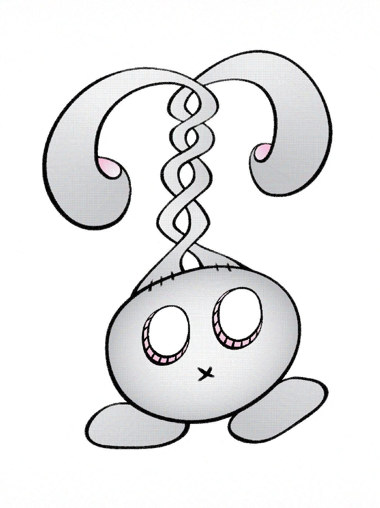
Twisted Bunny

COLLECTION: VACANTS
Vacant Teddy
BRAND NEXT STEPS
Having designed our three primary creatures, we are excited to combine them in unique ways and integrate more elements into our T-shirt graphics. Inspired by our affection for the adorable Pika, which we used to see on hikes at Mt. Baker, we plan to incorporate mountain imagery. This next phase will diversify our designs and strengthen our brand’s narrative by blending the fantastical with the natural world.



UI/UX
Analyzed competitor sites and mapped customer journeys to optimize the shopping experience, then designed user flows and wireframes to create an intuitive purchasing path, building an accessible UI system in Figma with reusable components to ensure consistent, user-friendly interactions.
COMPETITIVE ANALYSIS
Before beginning work on the website for We Make Eyelet, we revisited the websites of clothing brands that inspired us and surveyed the broader online presence of our competition. In our competitive analysis, we examined key factors such as target audience, unique selling propositions, and strengths and weaknesses. This comprehensive review helped us highlight important elements for our audience, adopt best practices, and differentiate We Make Eyelet as a unique brand.
TOOLS & PROCESS
For researching brands, I used ChatGPT. Its dialog-based approach allows for refining searches interactively, providing more focused and relevant information compared to Google’s ad-heavy search results. I then used Notion to collect and organize this research, creating detailed databases and organized notes for efficient categorization and cross-referencing of information. This structured approach ensured thorough documentation and easy access to all aspects of the competitive analysis. My research skills and attention to detail helped identify key trends, refining We Make Eyelet’s market positioning.


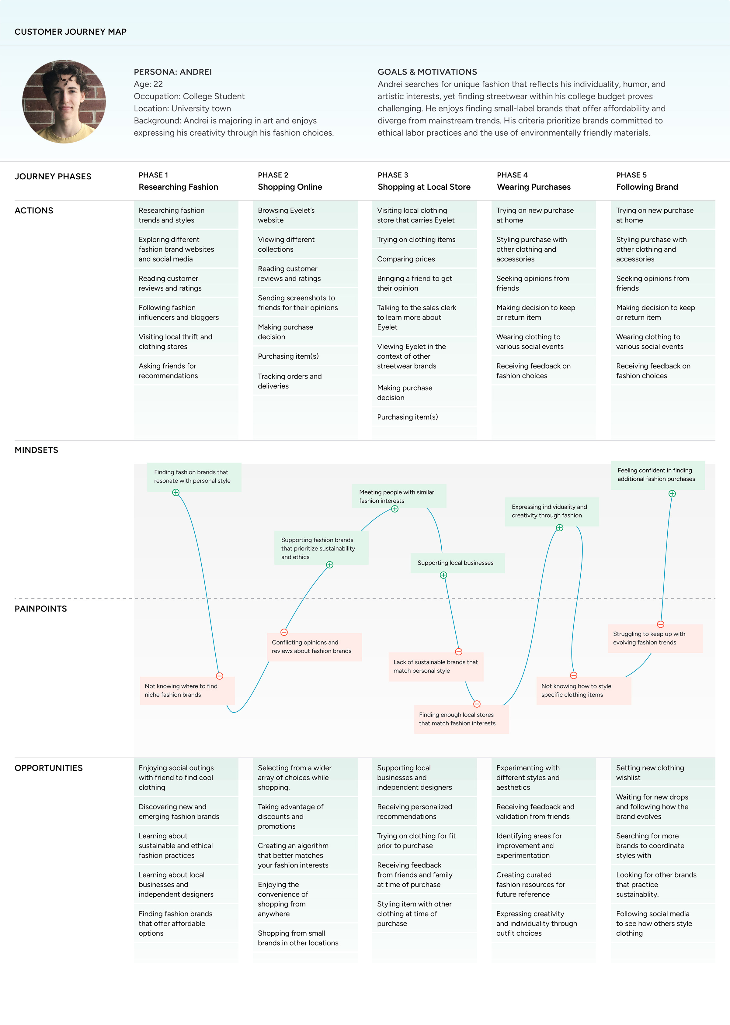
CUSTOMER JOURNEY
We mapped the customer journey for We Make Eyelet to understand the unique behaviors, preferences, and challenges our young adult fashion customers face. This highlighted the need for affordable clothing, the desire for personal expression through fashion, and the importance of sustainable practices. By leveraging this understanding, we optimized our web design to address specific pain points, such as budget constraints and the search for unconventional styles, while creating a visually engaging and user-friendly shopping experience that strengthens their connection to our brand.
TOOLS & PROCESS
To map out the customer journey, I began by taking the Interaction Design Foundation’s Journey Mapping course, gaining valuable insights into effective journey-mapping strategies. Using the AI plugin QoQo in Figma, I created the initial drafts of the customer journey. I then enhanced these drafts with ChatGPT, using prompts derived from our persona data and competitive analysis insights. To ensure our approach was industry-specific, I reviewed customer journeys from similar fashion businesses, refining our journey map to meet the unique needs of our audience.
User Flow
The user flow diagram for the We Make Eyelet website illustrates the steps from the homepage to the completion of a purchase. Users arrive on the homepage, where they can select categories and collections or use the search function. When choosing a product, they view detailed pages with images and descriptions and select from quantity, size, and color options. Users can then add products to their cart or choose to buy now. The cart review step allows for updates or continued shopping. At checkout, users can log in, create an account, or continue as a guest. They then enter shipping information and select shipping options. Payment details are entered or selected from saved methods. Users review their orders before confirming the purchase. This comprehensive flow ensures a seamless and intuitive shopping experience, optimizing user satisfaction and conversion rates.
TOOLS & PROCESS
I began by designing the user flow in FigJam and experimenting with the AI generator. However, the generated flows were too basic and lacked essential decision points. To create a more comprehensive user flow, I reviewed ten e-commerce sites to identify best practices. After mapping the user steps in FigJam, I imported the flow into Figma. This allowed me to incorporate additional shapes and borders, providing better control and refinement for a detailed and accurate representation of the user journey.


WIREFLOW
I created a wireflow diagram for the We Make Eyelet website to map the user journey from the homepage to the product page. This wireflow emphasizes intuitive navigation and user-friendly design, visually illustrating how the interface adapts to user interactions. By combining wireframes with user flows, I identified usability issues early in the process, facilitating an iterative design approach. This method ensured the design aligned with our UX goals before moving to high-fidelity prototypes.
TOOLS & PROCESS
Using Figma, I created low-fidelity wireframes to capture the layout and functionality, ensuring the design’s effectiveness and alignment with user needs before transitioning to high-fidelity prototypes.


TOOLS & PROCESS
For this project, I transitioned from Adobe XD to Figma, initially expecting a straightforward switch. I quickly realized that Figma offers significantly more advanced features. The introduction of variables to Figma’s UI and prototyping workflow greatly improved efficiency. Although learning to use variables took time, finding resources beyond YouTube tutorials proved helpful. I researched UI kits and chose UI Prep’s UI System for my Figma files. This choice guided my learning with best practices, streamlining the design process and ensuring a high level of organization and consistency throughout the project


HIFI PROTOTYPE
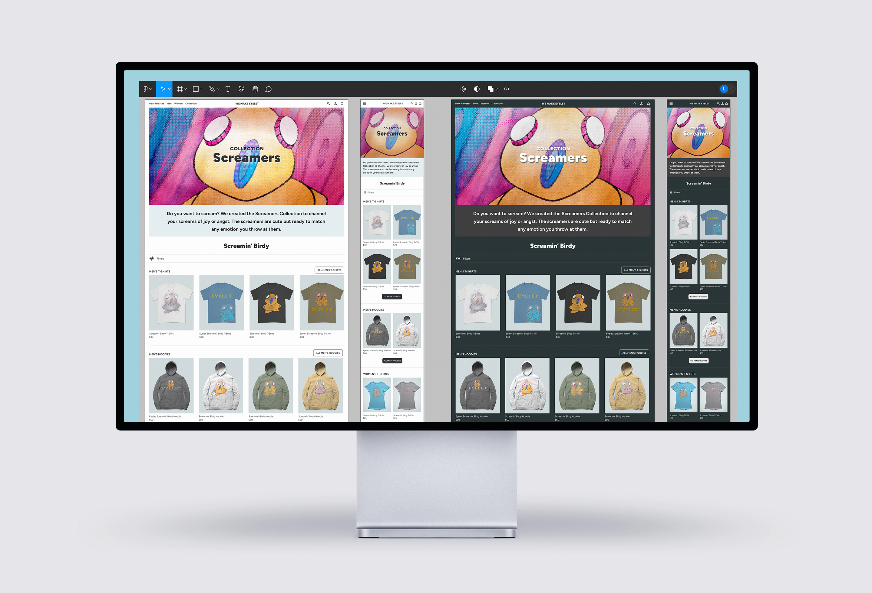
The HiFi prototype for the We Make Eyelet website effectively demonstrates the journey from the home page to the collection page, product page, and add-to-cart functionality. This prototype highlights the ease of navigation and engaging user experience that defines the We Make Eyelet brand.
TOOLS & PROCESS
To develop the HiFi prototype, I used Figma, applying its advanced features, such as tokenized variables for colors and spacing, to maintain consistency and efficiency across the design. I created components with variants and auto-layouts to ensure a responsive design, reflecting the high standards of visual design and user experience central to the We Make Eyelet brand.
DIGITAL DEVELOPMENT NEXT STEPS
After building the hi-fi prototype, my next steps include conducting user testing to gather feedback and identify any usability issues. Based on this feedback, I will refine and iterate on the design to ensure it meets user needs and accessibility standards. Once these refinements are complete, I will build the site using Elementor on WordPress. To facilitate online shopping, I will integrate WooCommerce for product management and Stripe for secure payments. Additionally, I will use Google Analytics to track user behavior and optimize the shopping experience, ensuring a seamless and intuitive process for customers.
PLAYGROUND : )
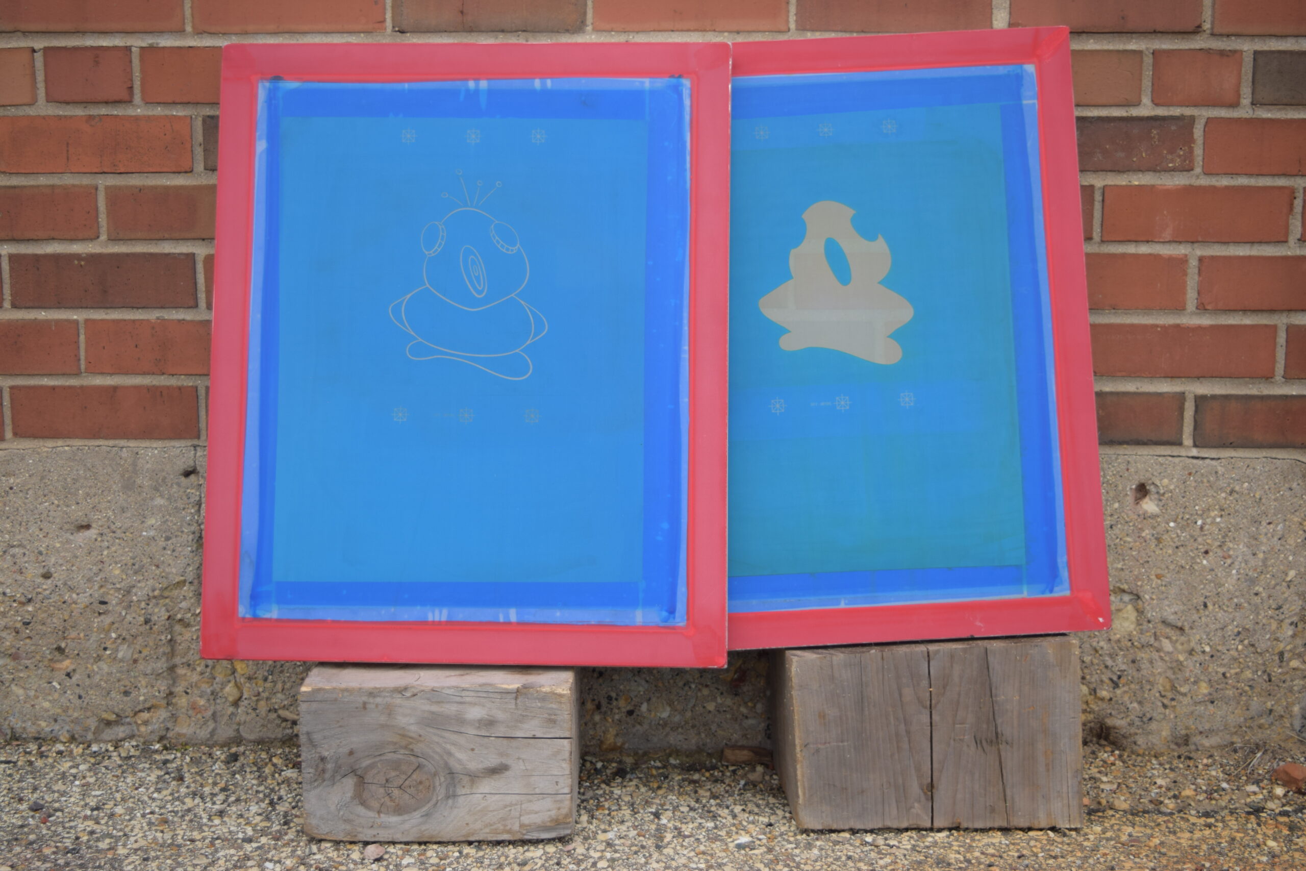
From pencil to brush to squeegee to Cinema 4D, there are endless opportunities for creature fun!
