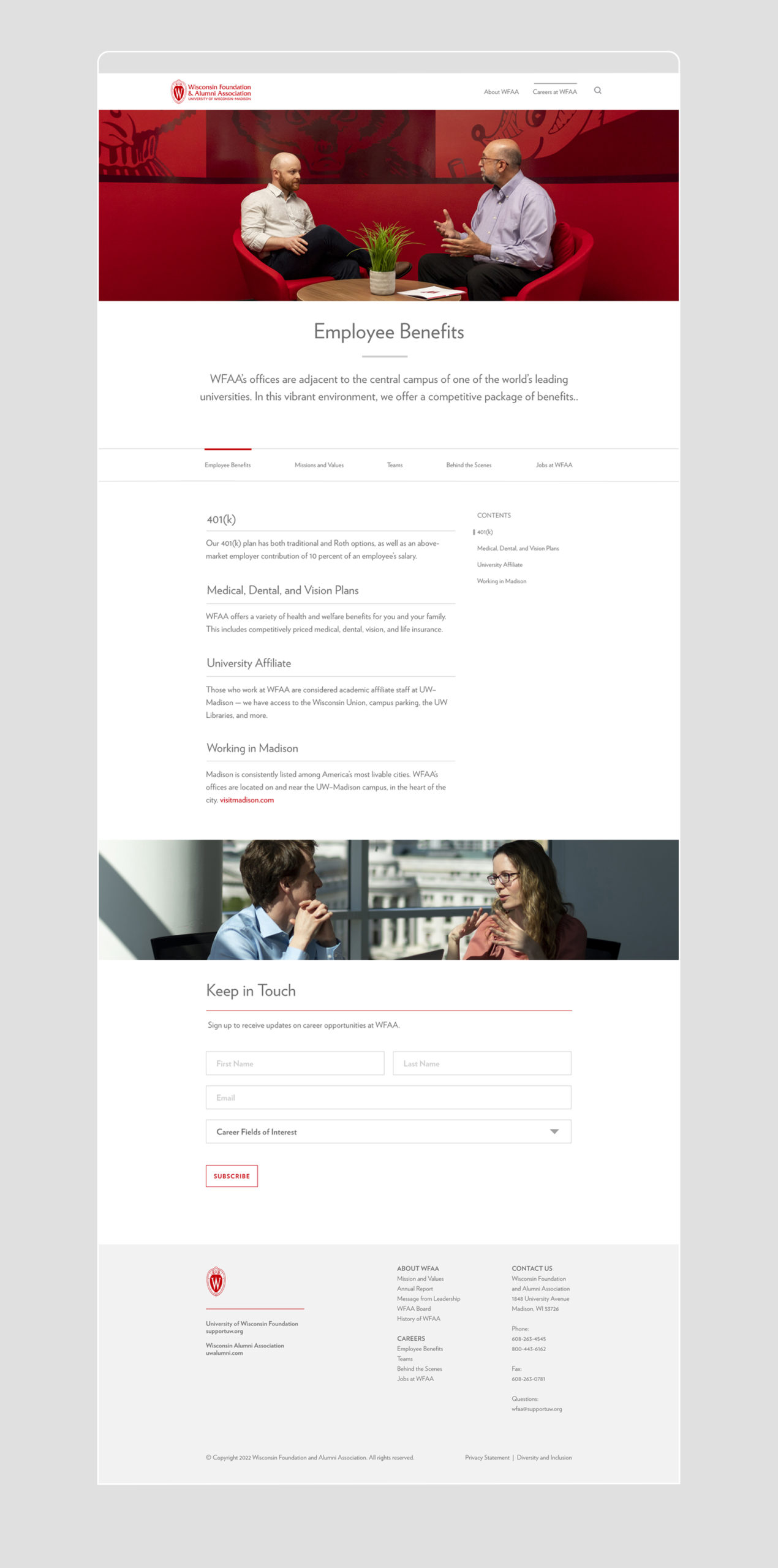
The WFAA website was redesigned with a focus on clarifying the organization’s mission and enhancing recruitment efforts. The new site features simplified navigation and a clean, sophisticated design to effectively communicate who WFAA is and engage potential staff.
ROLE
Photo Direction, UI Designer, and Web Designer
TEAM
Collaborated with Digital, Communications, Marketing, Human Resources, and Leadership Teams
The merger of the University of Wisconsin Foundation and the Wisconsin Alumni Association into Wisconsin Foundation and Alumni Association (WFAA) had left alumni, donors, and potential staff puzzled about the organization’s function. The existing websites did not effectively communicate WFAA’s role or facilitate staff recruitment. This necessitated a streamlined and more intuitive design that would resonate with all stakeholders.
DESIGN SOLUTION
The website was redesigned to focus on two main objectives: clearly defining WFAA’s mission and enhancing recruitment efforts. The navigation was simplified into two main sections: “About WFAA” and “Careers at WFAA.” A minimalist design featured white space and lightweight typography to maintain a clean and elegant look. Additionally, vibrant staff and campus photography were used to add personality and establish a connection to the UW brand.
KEY HUBS
The website’s homepage provides a quick overview of WFAA, with easy navigation options to learn about WFAA or explore career opportunities. The homepage has clear sections highlighting critical information about WFAA’s mission and how to find career opportunities. This layout ensures visitors can quickly understand WFAA’s essence and access relevant information tailored to their interests.
PHOTO DIRECTION
I directed a comprehensive photo and video shoot, capturing over thirty staff members in diverse settings within WFAA’s offices. The aim was to showcase the organization’s vibrant culture and the UW brand’s iconic red in the website’s visual narrative.
PHOTO INTEGRATION
By carefully selecting photos from the shoot, we were able to give the site a warm and authentic feel. We kept the design clean and uncluttered, using the Verlag typeface in book weight, white space, and subtle gray accents to complement the dynamic red tones from the photos. This effectively ties together the site’s visual and thematic elements.