Poseidon Vineyard collaborated with Typefields to bring a consistent old-world elegance to its packaging and marketing materials for its winery, vineyards, and cooperage.
ROLE
Brand, Packaging, and Print Designer
TEAM
Collaborated with Poseidon Vineyard owners and marketing team.
CLIENT
Poseidon Vineyard, previously a part of Obsidian Wine Co.
DESIGN PROBLEM
The client faced challenges establishing a consistent brand identity across their wines, vineyards, and cooperage. Their brand look ranged from modern and whimsical to old-world craftsmanship. They needed a cohesive packaging and print material strategy that accurately reflected their heritage and sophistication.
DESIGN SOLUTION
I leveraged my expertise in classic typography and layout to unify Poseidon Vineyard’s diverse wine labels and print collateral under one cohesive, elegant, and refined brand identity. This comprehensive redesign effectively communicated their products’ heritage, sophistication, and craftsmanship, enhancing overall brand consistency.
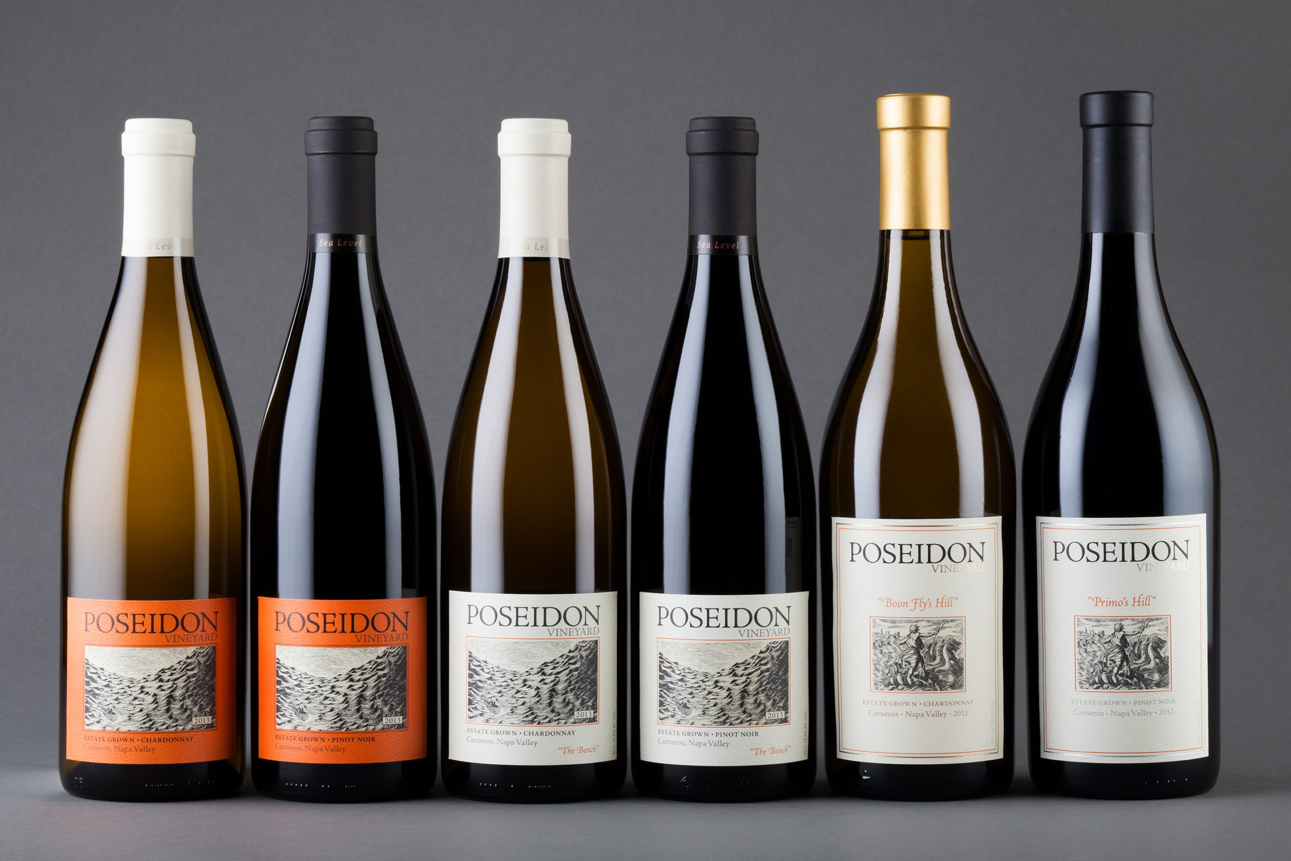
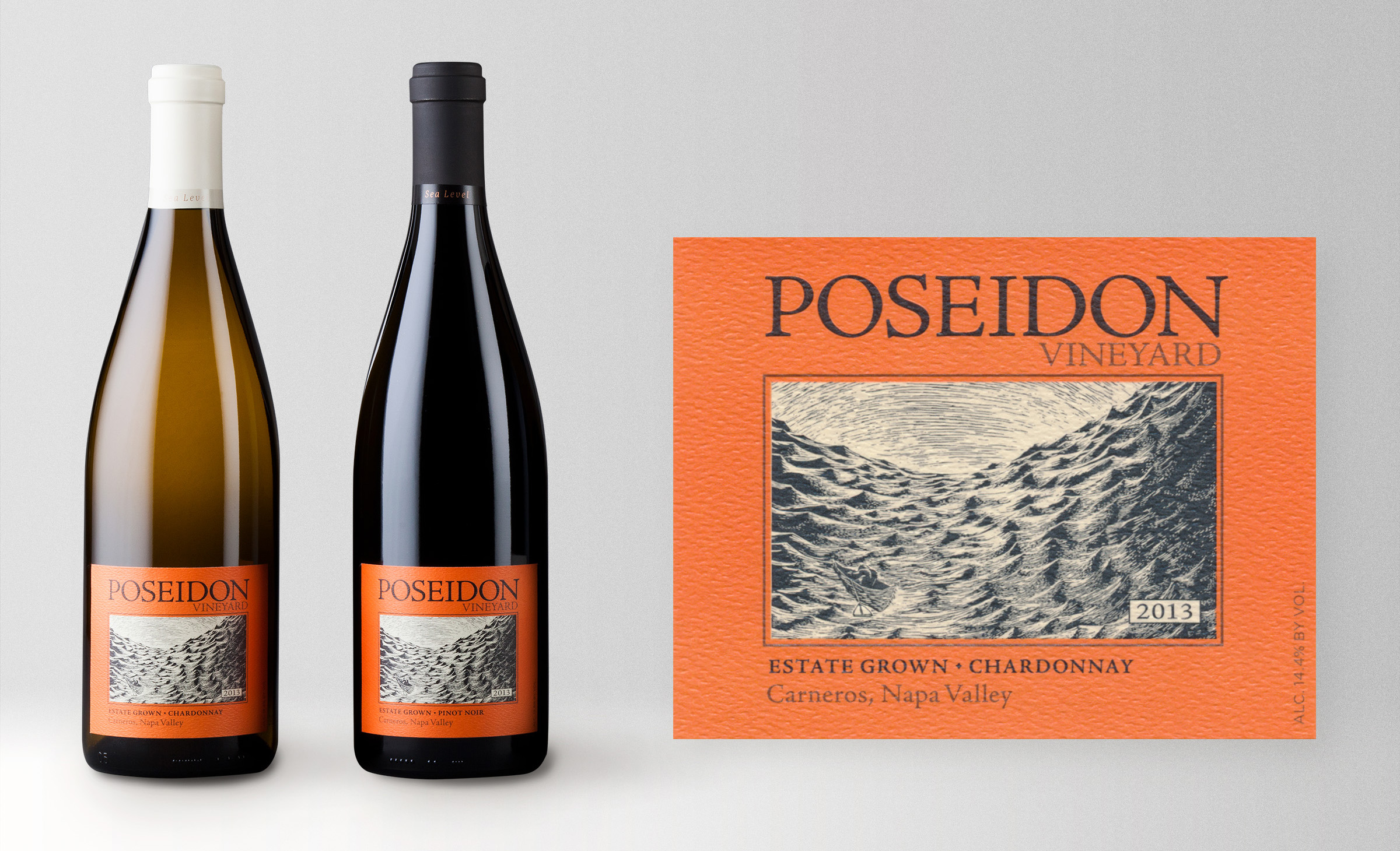
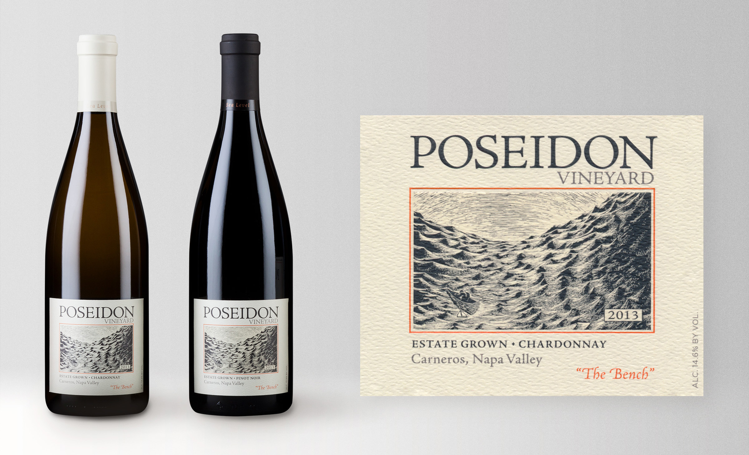
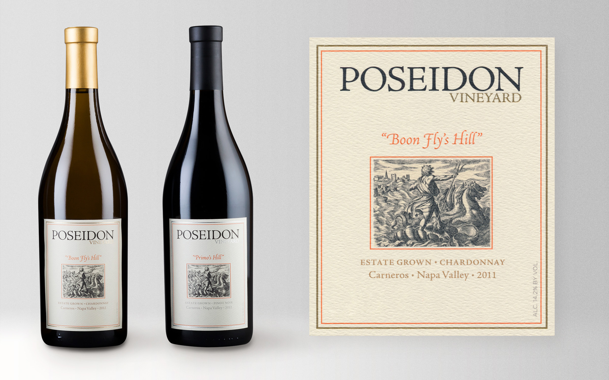
POSEIDON VINEYARD
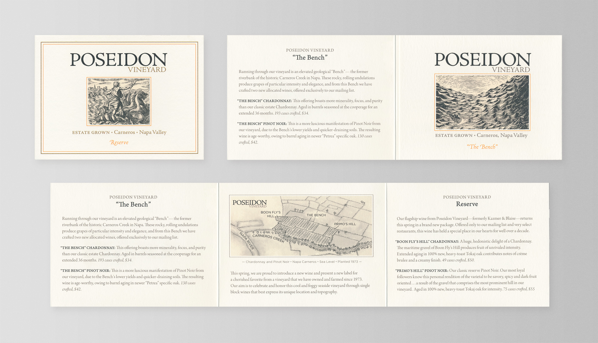
I redesigned the labels for the core Poseidon Vineyard wines, using an engraving of a tumultuous sea to evoke the god Poseidon and highlight the vineyard’s proximity to San Francisco Bay. Each label features refined typography and detailing to convey old-world sophistication. I distinguished the varietals by color and label shape, while the two premier wines showcase an engraving of Poseidon and metallic foil accents.
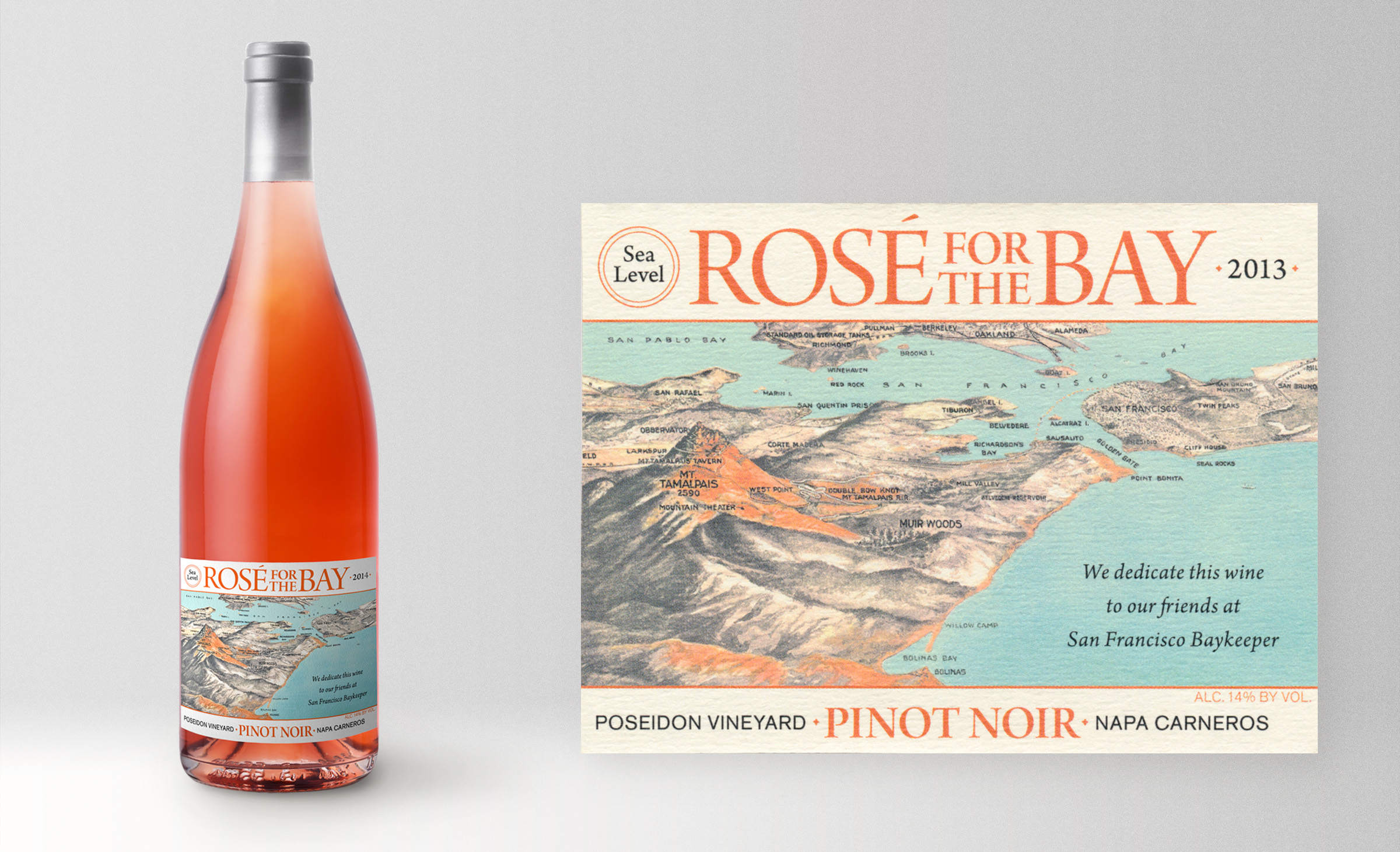
ROSÉ FOR THE BAY
The label design I created for Rosé for the Bay by Poseidon Vineyards showcases the vineyard’s proximity to San Francisco Bay and my client’s support for the environmental organization Waterkeepers’ work preserving the Bay. The design features a historic map with enhanced colors depicting a vibrant bay and landscape, complementing the rosé. Classic typography adds elegance and emphasizes the wine’s quality and heritage.
PRINT COLLATERAL
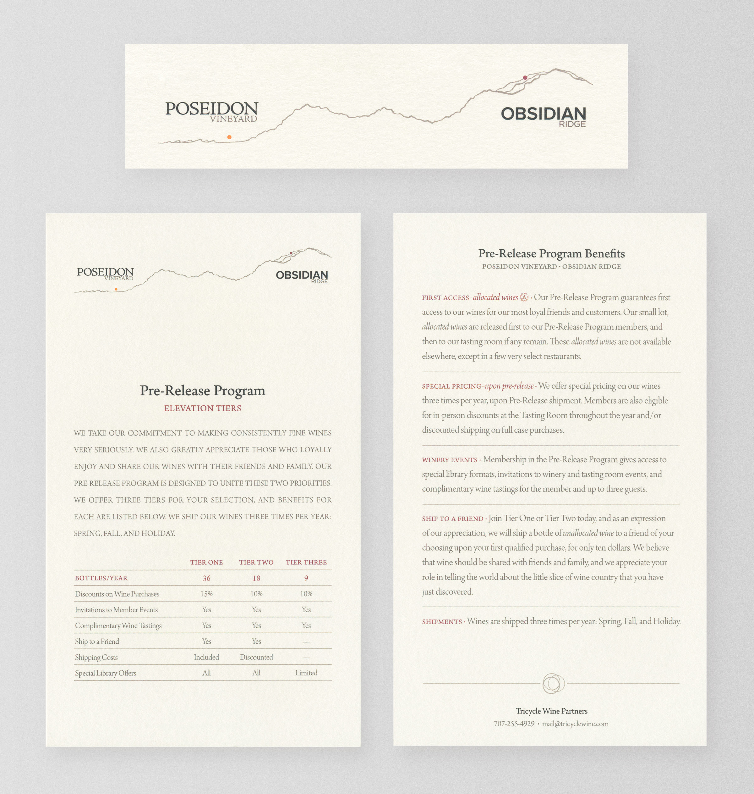
I designed a sophisticated mailer and a detailed membership tier sheet for Poseidon Vineyard, using classic typography and traditional page layouts. The line art illustrates the drastic elevation difference between the Poseidon Vineyard and Obsidian Ridge vineyards. These pieces reflect the brand’s refined identity and provide a cohesive, elegant presentation of the winery’s offerings.