Stewardship Book
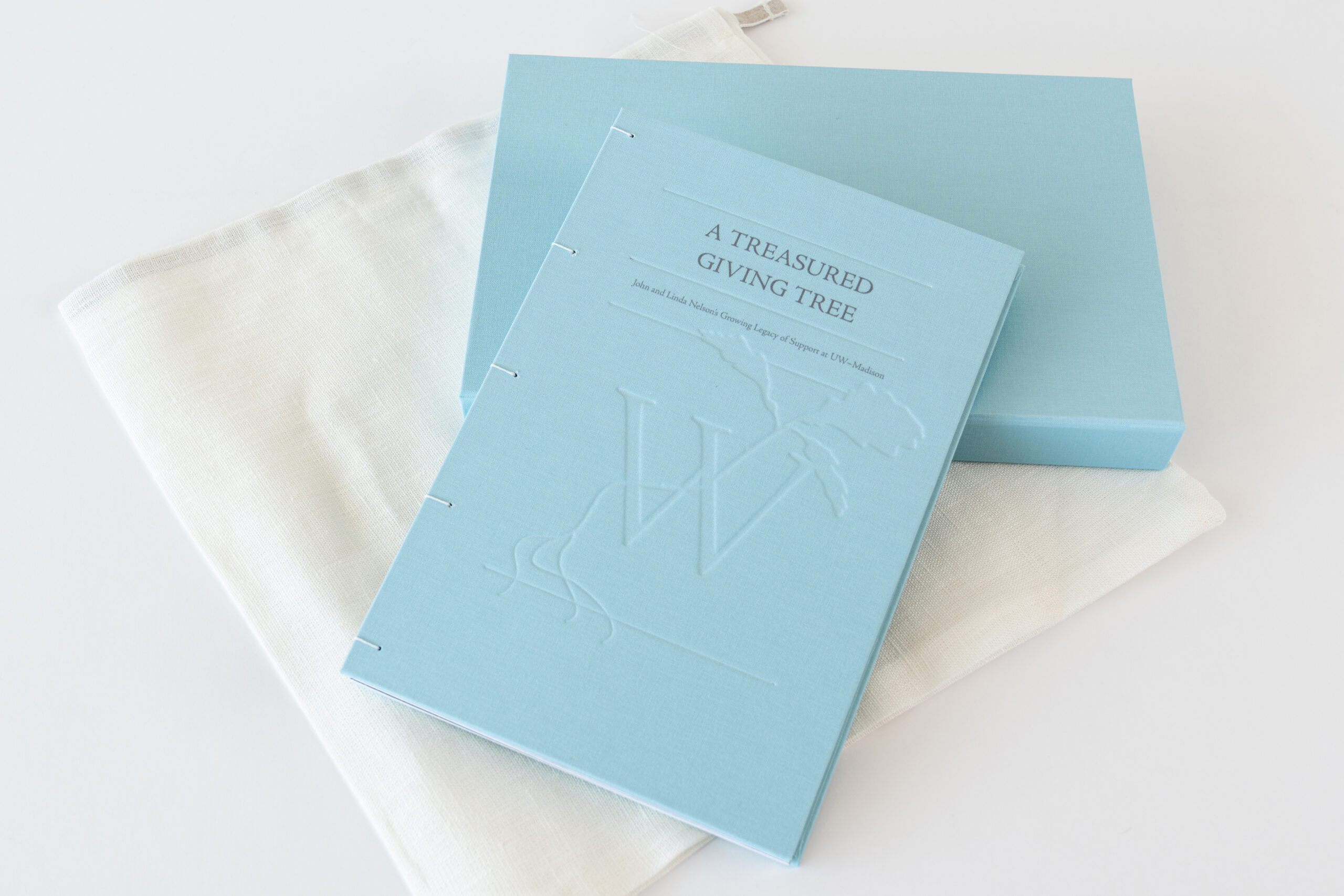
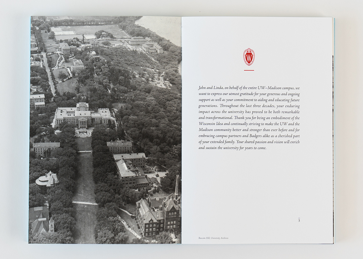
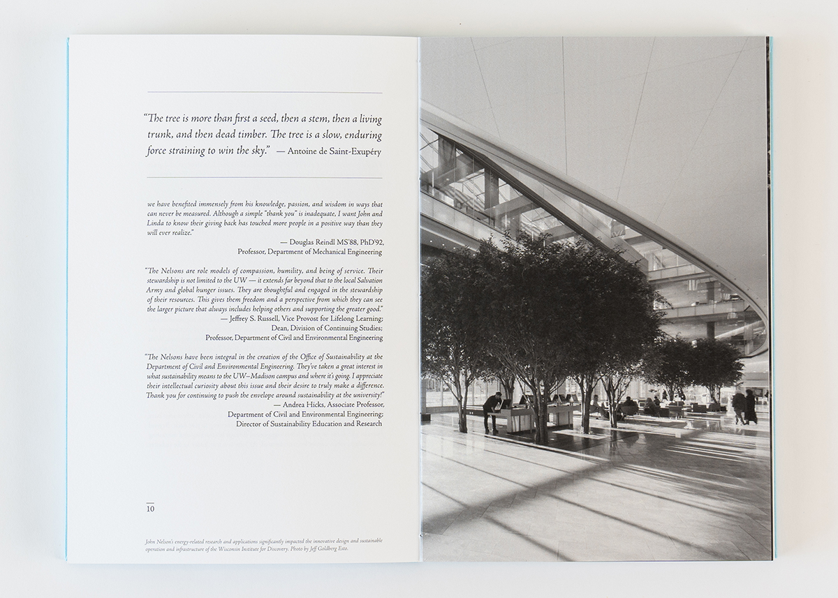
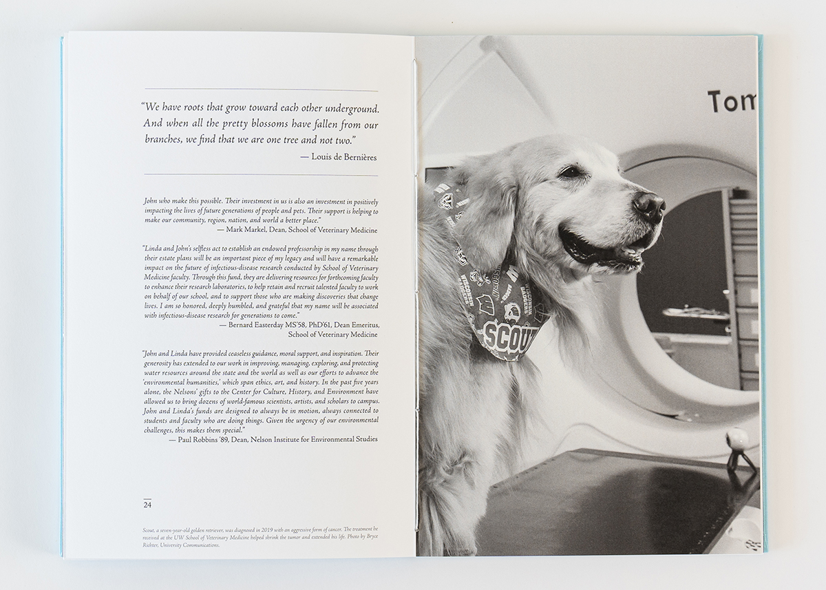
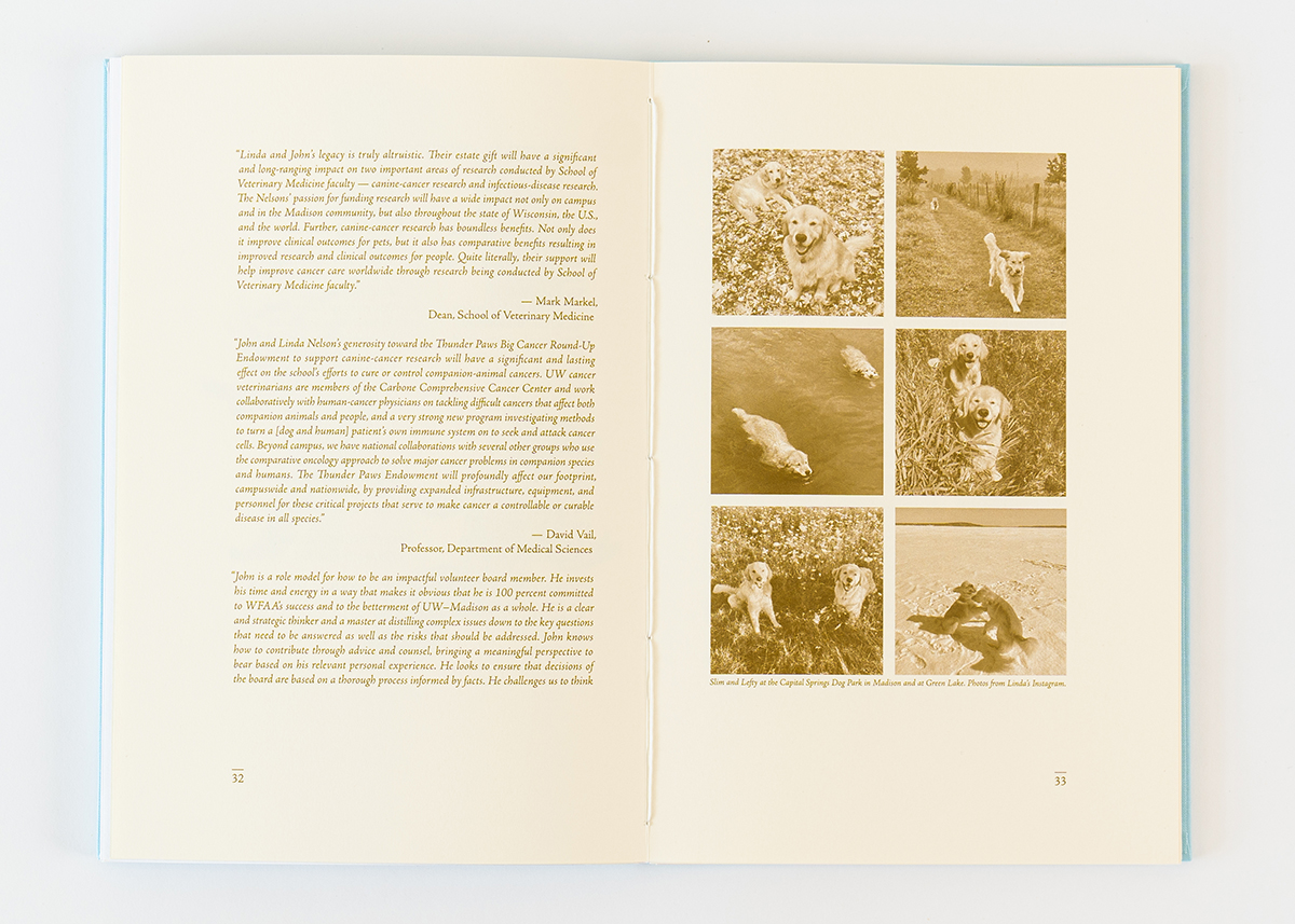
We created a stewardship book to commemorate an alumni couple who have supported UW–Madison for over 30 years. The book features stories and testimonials that highlight the impact of their giving. Using tree imagery and campus photos, we combined heartfelt storytelling with elegant visuals to celebrate their enduring contributions.
ROLE
Art Direction and Design Lead
TEAM
Collaborated with Principal Gifts, Development, Communications, Production, and Marketing at WFAA, as well as our campus partners, the College of Engineering, and the Nelson Institute for Environmental Studies.
DIVISION
Principal Gifts
DESIGN PROBLEM
The primary challenge was to create a stewardship impact report that highlights the donors’ significant contributions and engages them emotionally. It was important to avoid a siloed presentation of their support across various university departments. Instead, the report needed to tell a cohesive story that emphasizes the broader impact of their philanthropy on both the university and the community.
DESIGN SOLUTION
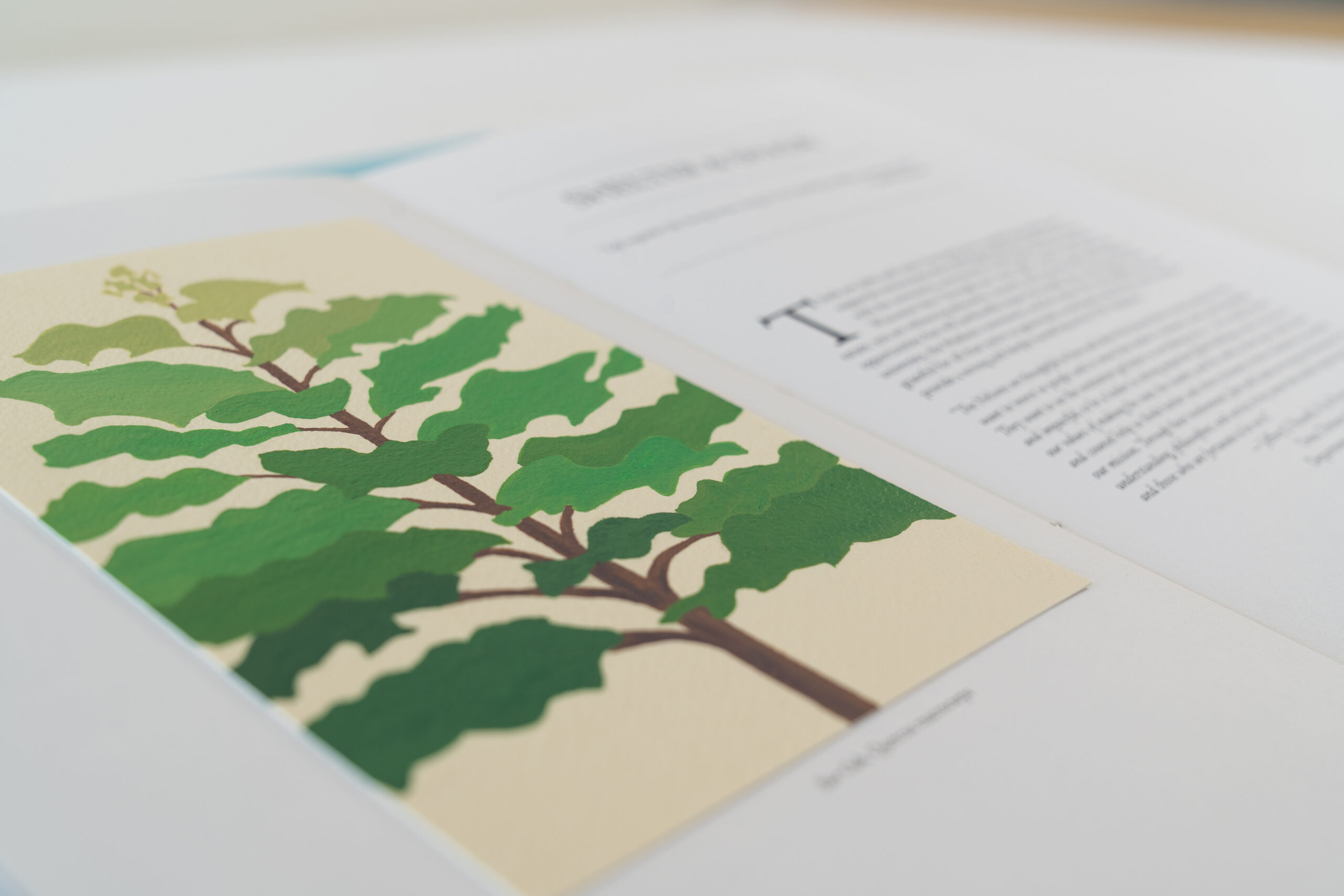
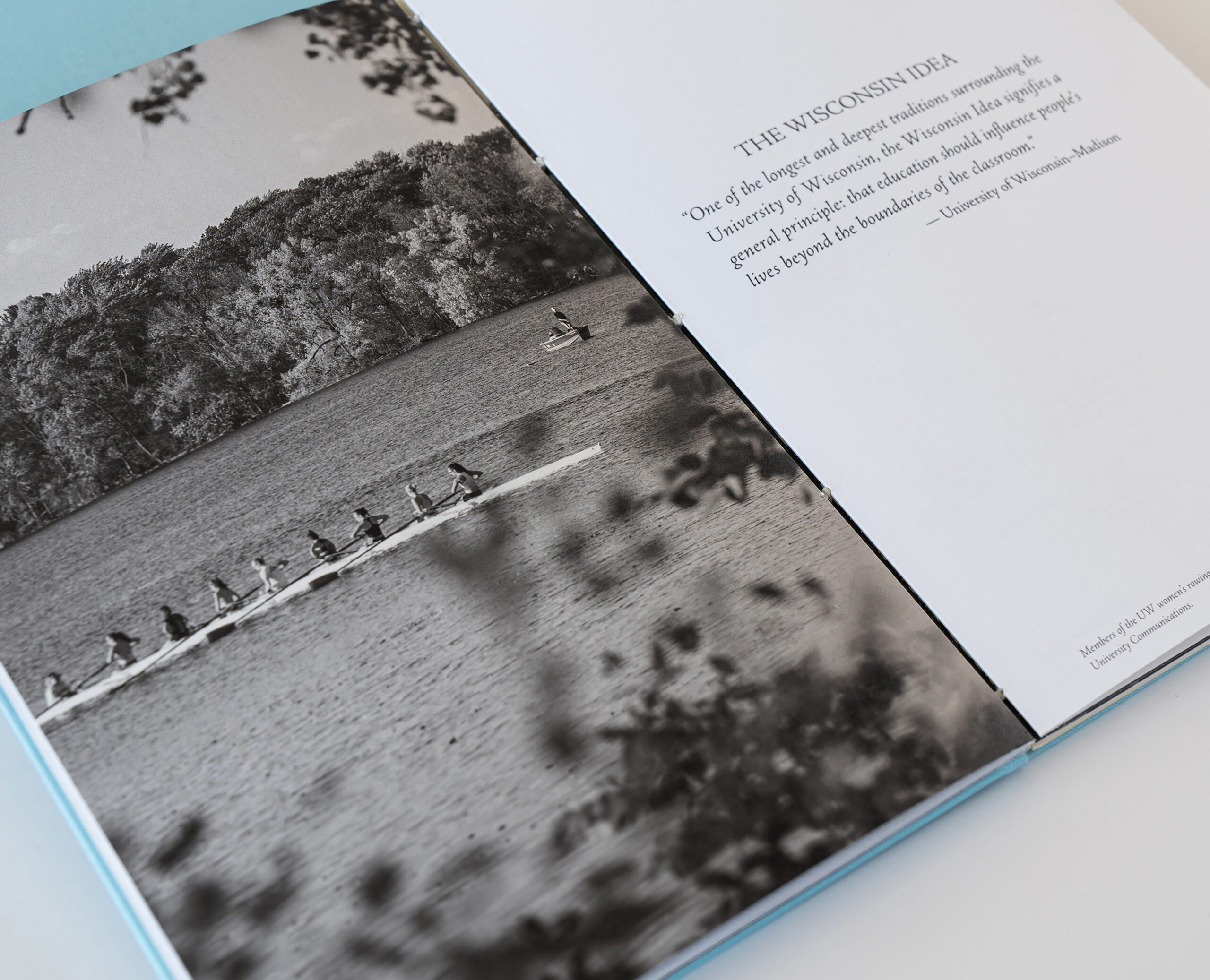
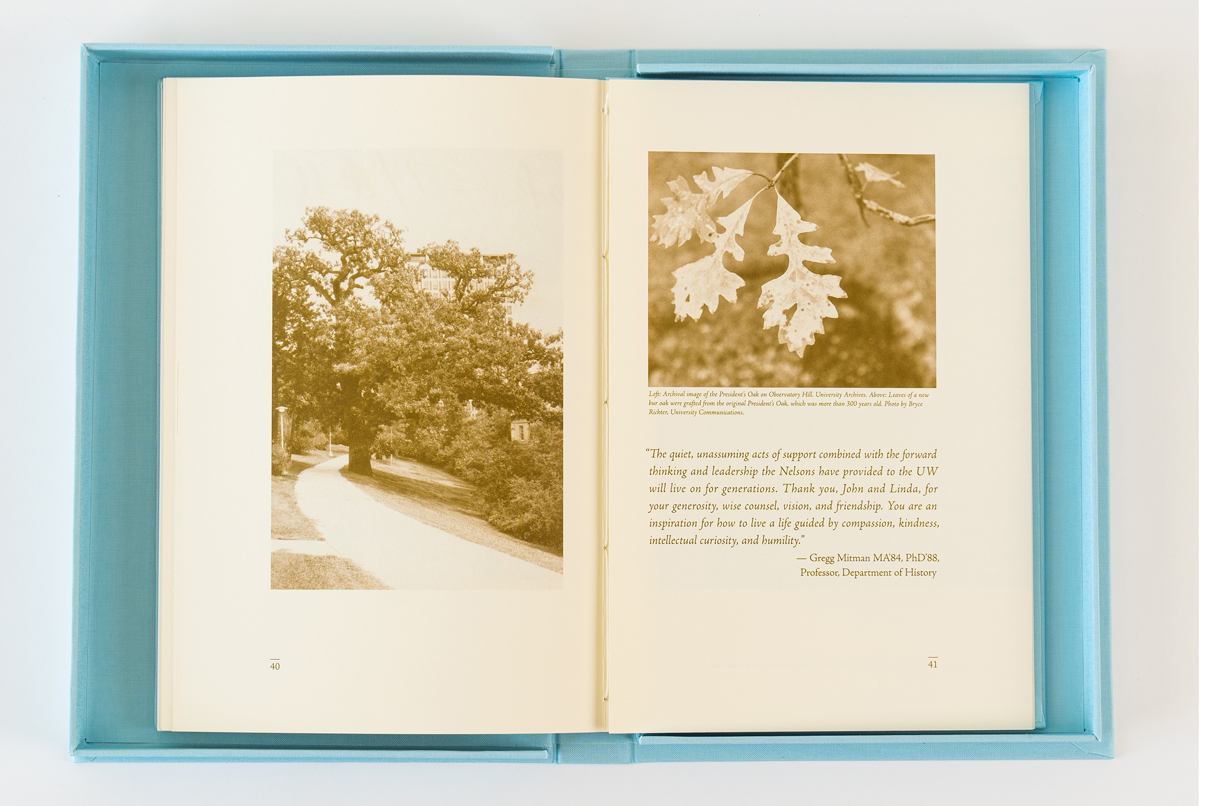
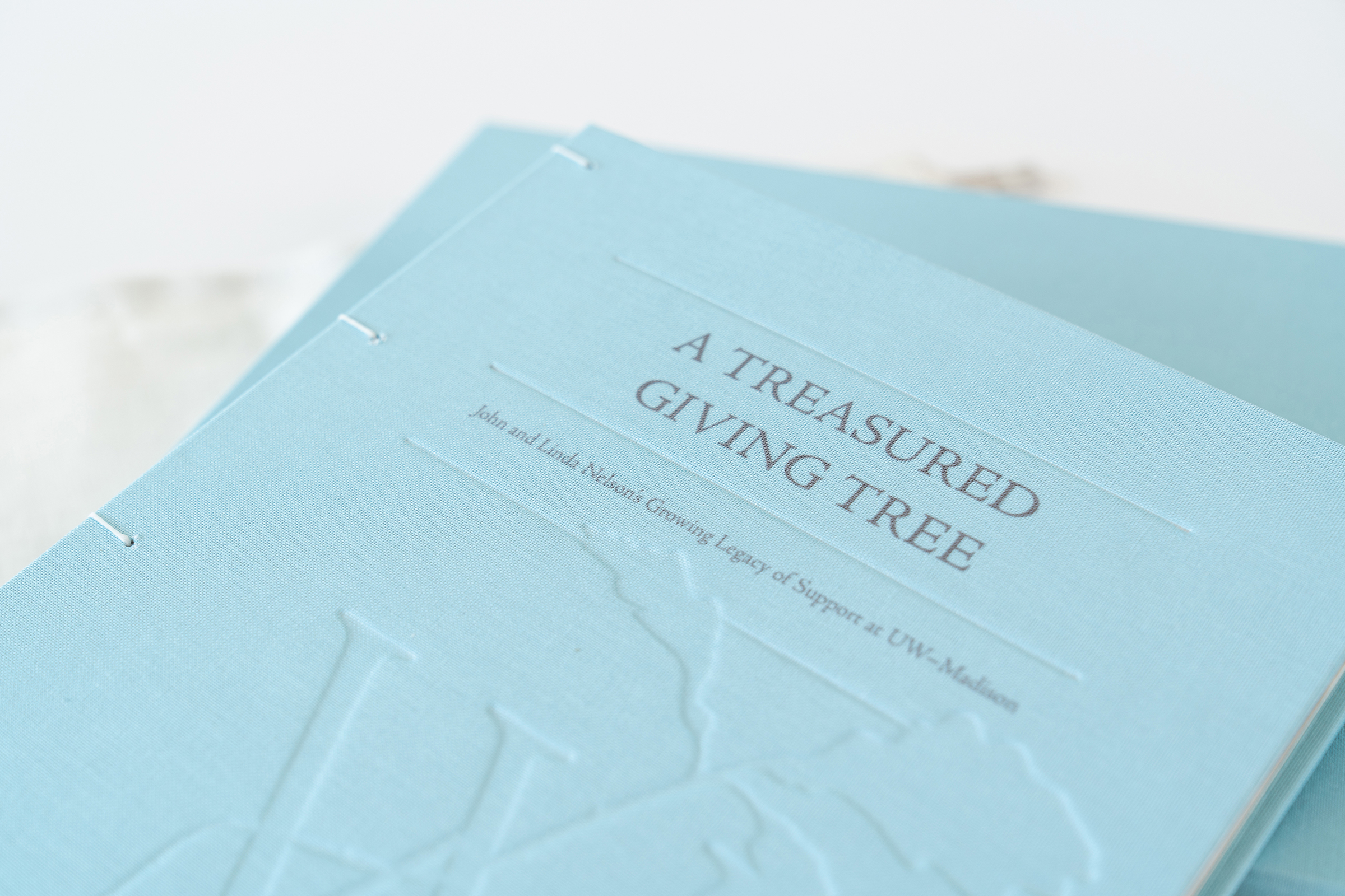
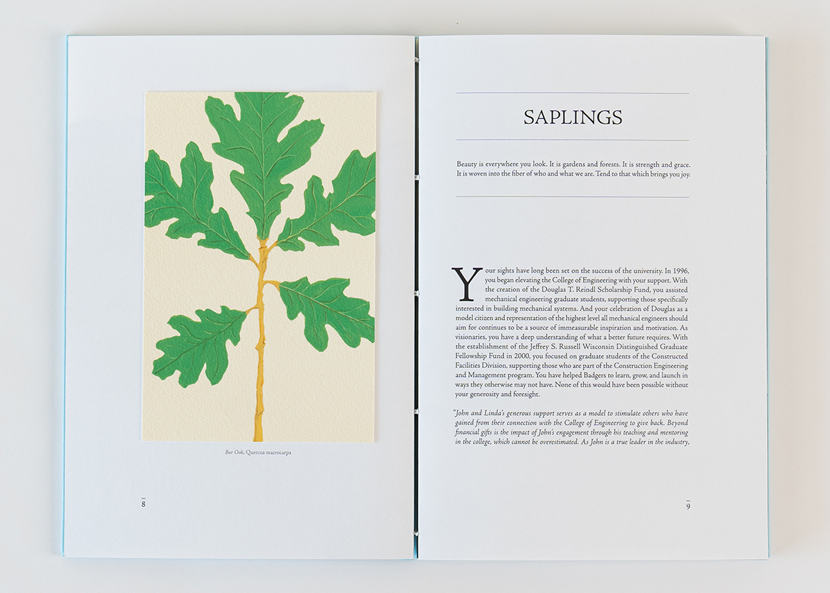
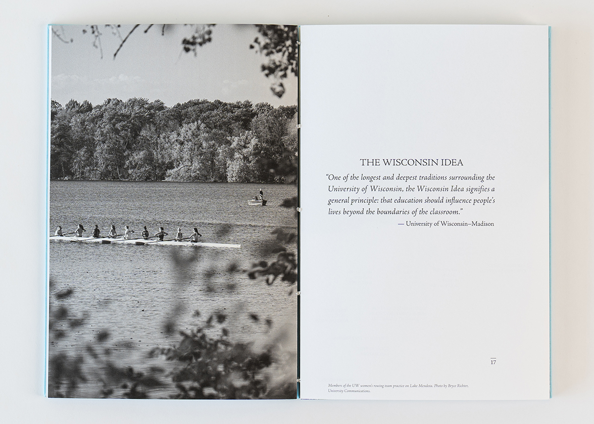
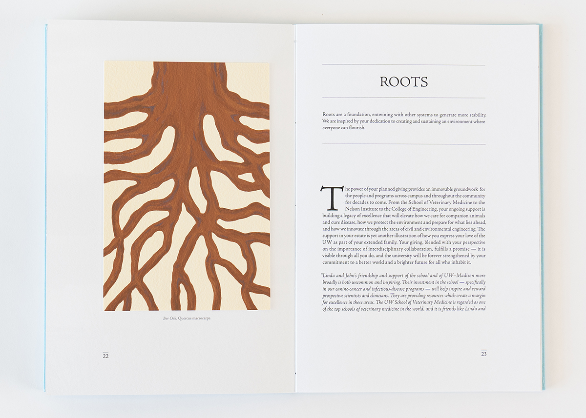
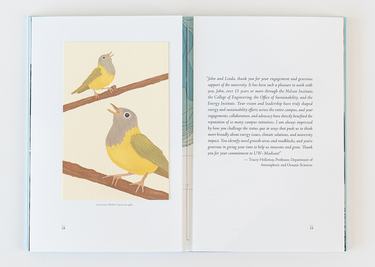
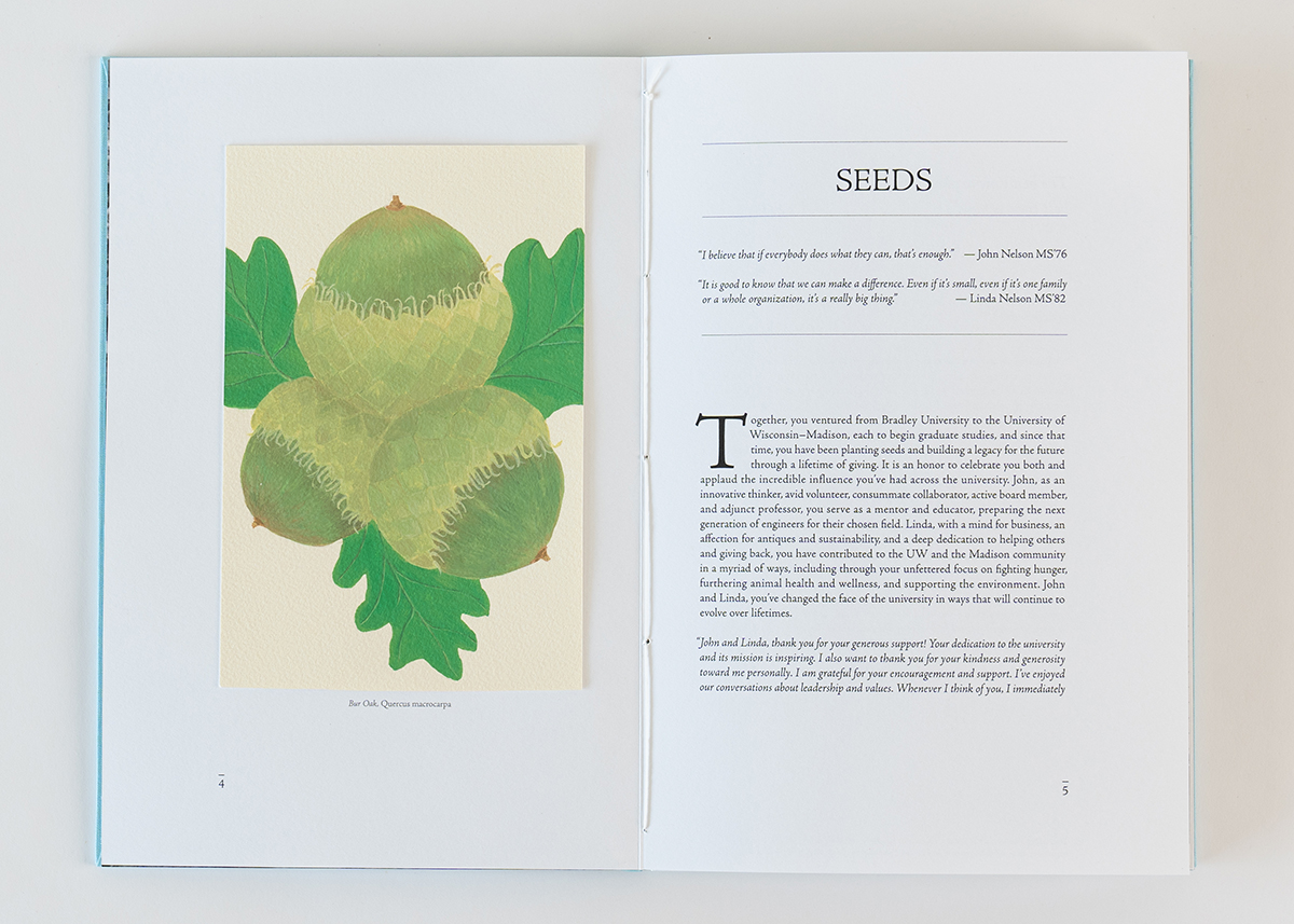
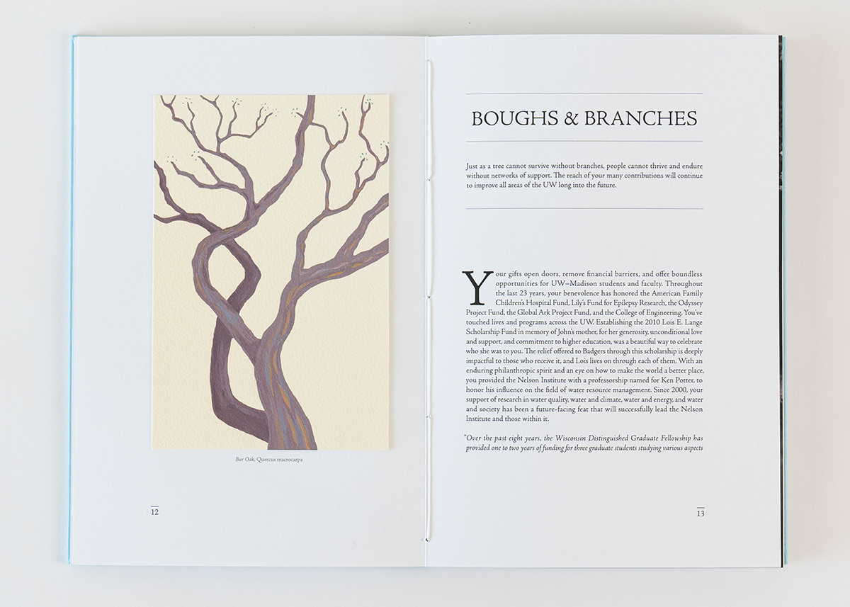
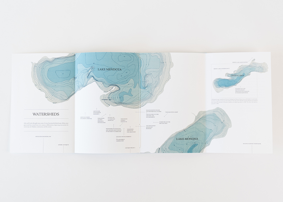
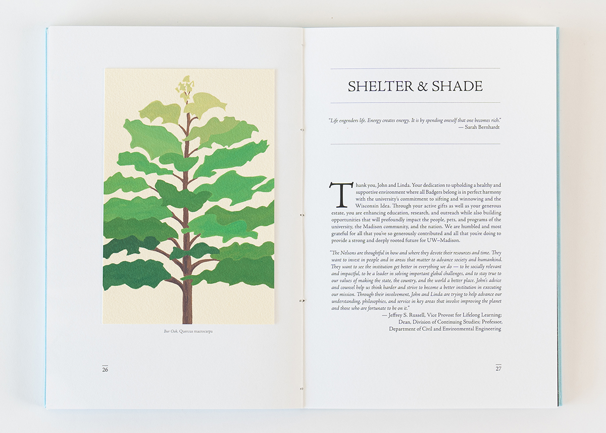
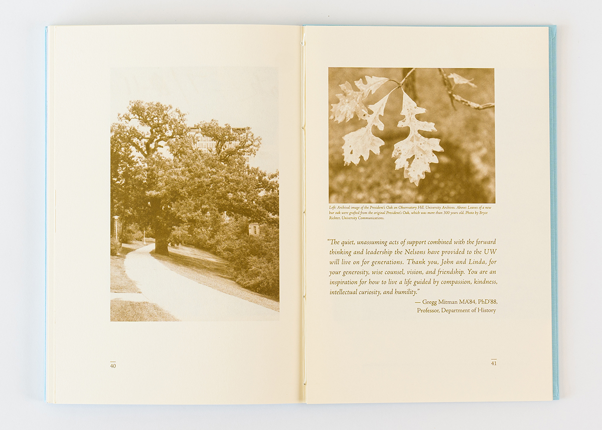
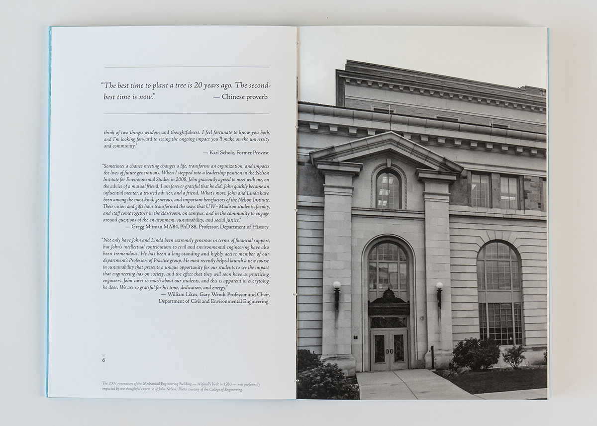
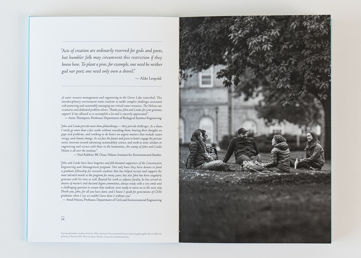
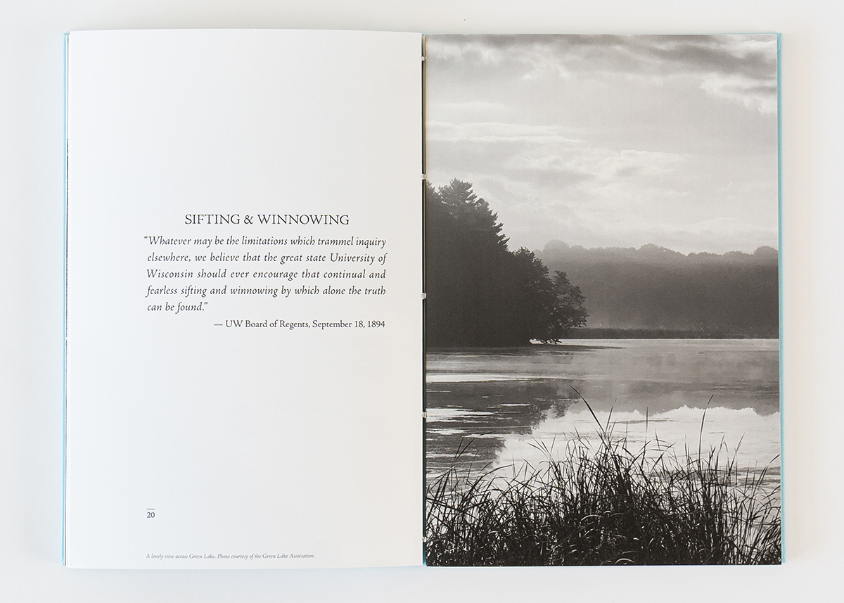
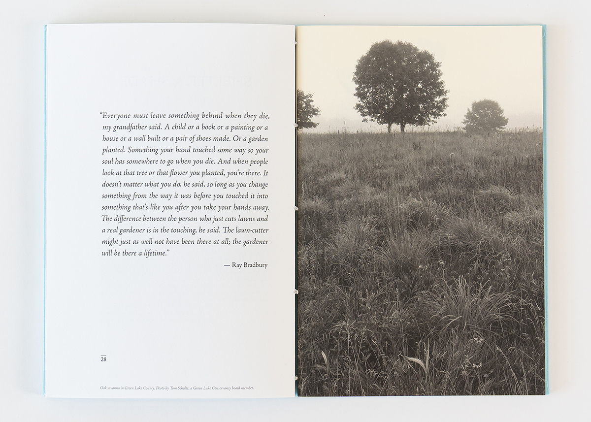
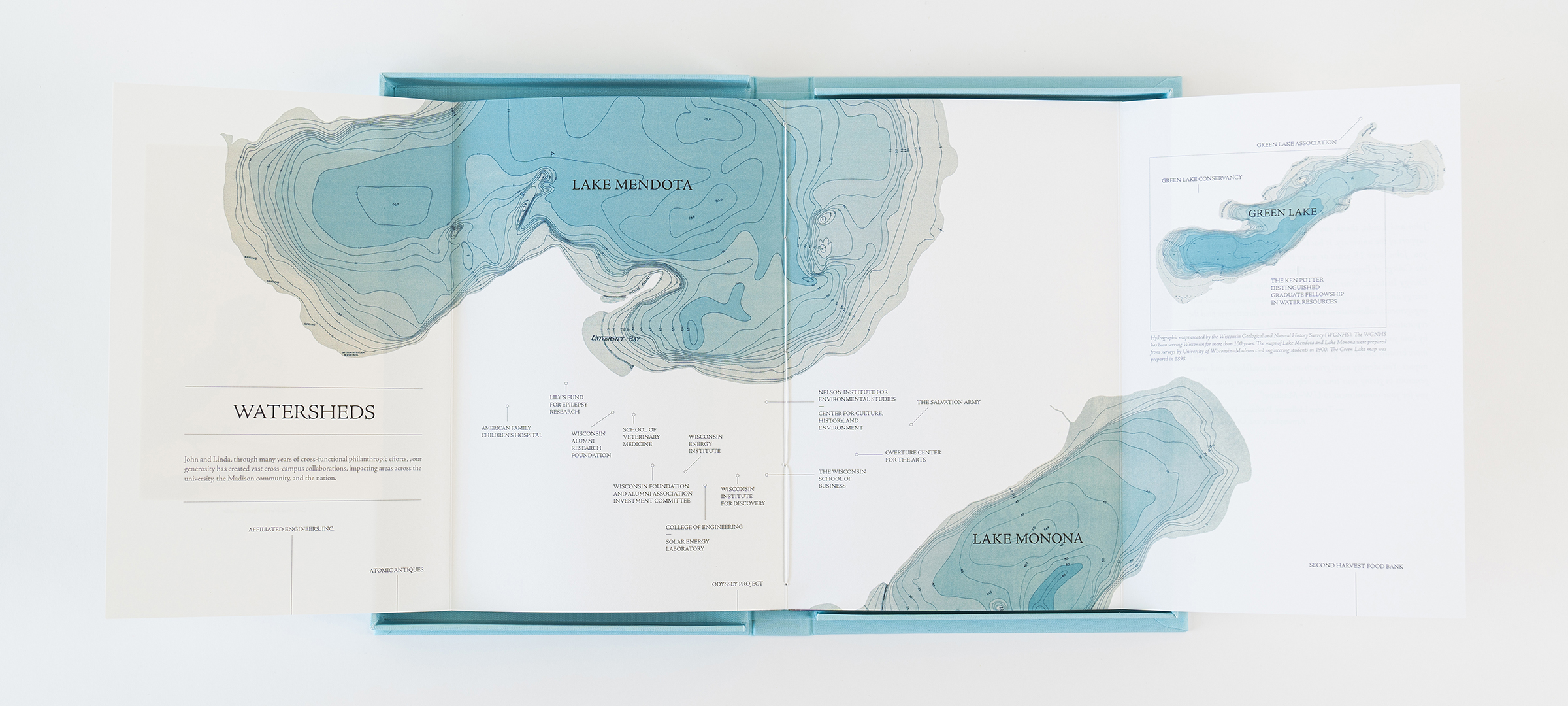
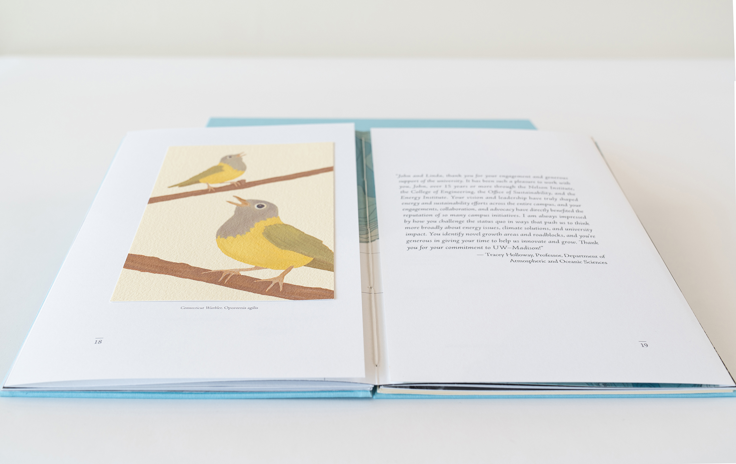
Sustainability is important to the donors, who believe philanthropy is like planting a tree whose shade future generations will sit under. By employing a tree theme, the writing and design effectively connected the donors’ diverse areas of support. To reflect their work in water conservation, we created a center spread with their areas of giving charted on hydrographic maps of Madison’s lakes. Using classic book design, typography, tipped-in paintings, and black-and-white photos, we created a timeless piece that enhances the personal and emotional resonance of the content.
VISUAL ELEMENTS
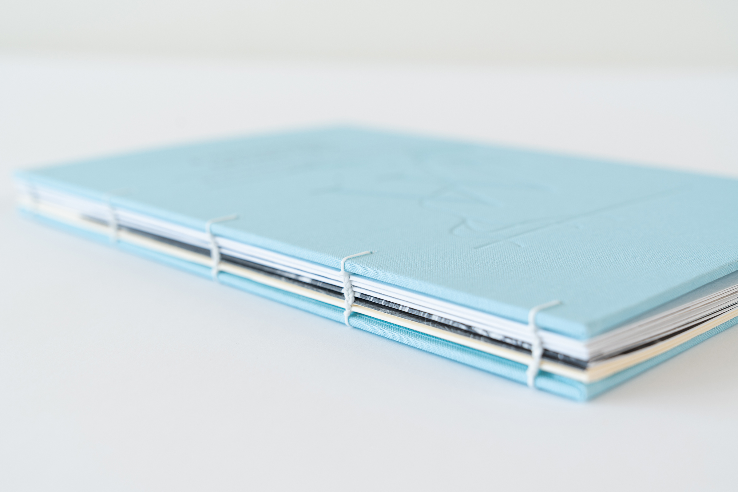
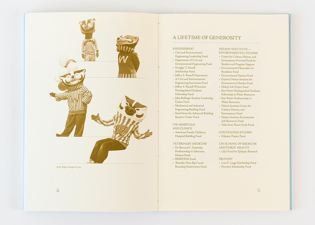
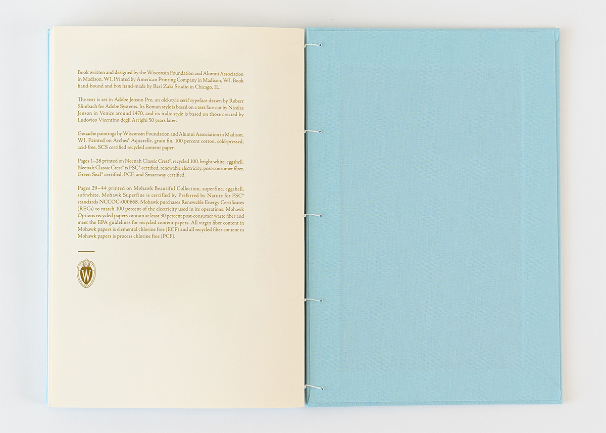
The visual elements of the stewardship book highlight the donors’ commitment to environmental responsibility and their appreciation for antiques. Classic typography and structured layouts, inspired by historical book design, create a sense of timeless elegance. I hand-painted custom tree images to symbolize the long-term growth and impact of the donors’ contributions. I carefully selected campus photos and hydrographic maps to align with the donors’ interests and the theme of water conservation. High-quality recycled paper and traditional binding techniques reflect the couple’s values of sustainability and craftsmanship. Each visual detail was meticulously curated to create a meaningful and memorable experience for the donors.
NARRATIVE FLOW
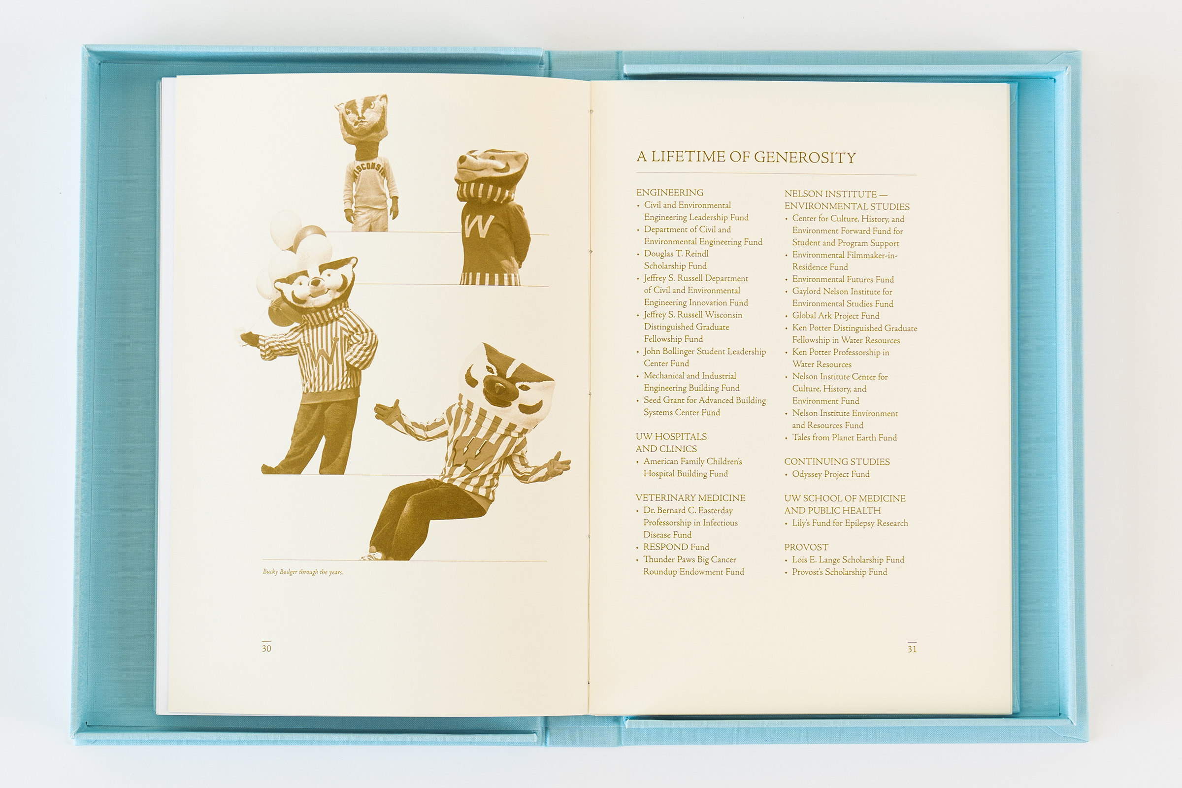
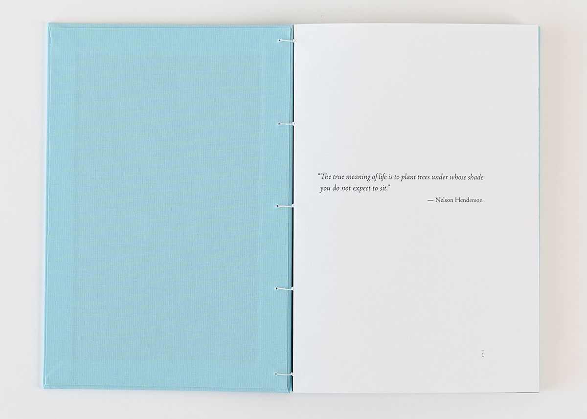
The stewardship book tells the story of the donors’ contributions thematically and chronologically. Each chapter reveals a different aspect of their contributions, using section headers such as “Seeds” and “Saplings” to depict their early days at UW and their initial funds. The consistent use of tree imagery throughout the book reinforces the connection to the donors’ values and legacy. This visual narrative, combined with storytelling, quotes, and pictures, tells a personalized story of the donors’ impact and shows the heartfelt respect and appreciation of the UW and the broader community.
MAPPING IMPACT
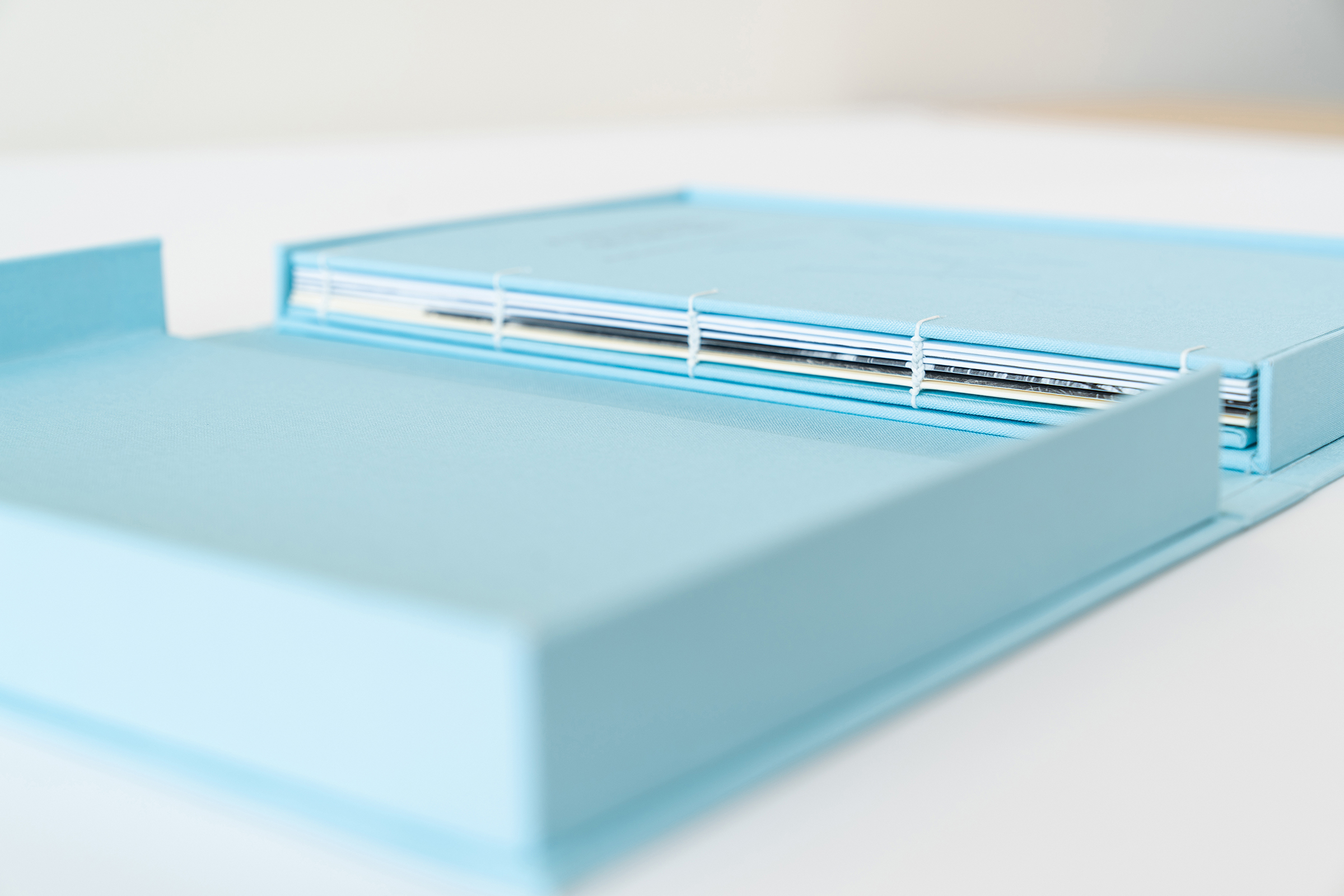
The center spread visually showcases the extensive impact of the donors, illustrating the breadth and depth of their philanthropy by connecting their gifts to various departments and initiatives across the university and beyond. The blue linen of the box and book cover foreshadows the blue of the hydrographic maps.
CRAFTING AN HEIRLOOM
The book was meticulously created to be a beloved keepsake. I paid attention to every detail, from the traditional binding methods to hand-painting images and using high-quality materials. This resulted in a beautiful and long-lasting book. It functions as a report and as an heirloom, honoring the donors’ contributions in a way that future generations can treasure.
RESPONSE & AWARD
Below is a note I received from the Associate Vice President and Director of Principal Gifts at WFAA after the design presentation for the stewardship book:
Awesome! Thanks. I chatted with Jim (Chief Marketing and Communications Officer) yesterday about how delighted I am not only with the team’s incredible work on the piece itself (which I described to him as an heirloom piece of art). I was also so impressed by the incredible professionalism of the presentation itself. I told Jim that I felt like I was in an ad agency presentation – your team worked so well together to communicate project goals, creative approaches, and design decisions in a way that was incredibly productive and inspirational. In fact, I could envision the donors really appreciating hearing more about that story from the team at some point… I’m just in awe of your poise and communication skills (not to mention creative talent!).
Bravo! WFAA is lucky to have talent like you. Thanks for everything. Ann
CASE AWARD
CIRCLE OF EXCELLENCE, SILVER
From the judges: “It was clear that a lot of thought went into creating a personalized and engaging report. The creative design is both beautiful and effective, making it a joy to read. The use of white space adds a clean and modern touch, making the content easy to digest. Overall, this report is an inspiration and sets a high standard for future publications. Great job!”
